
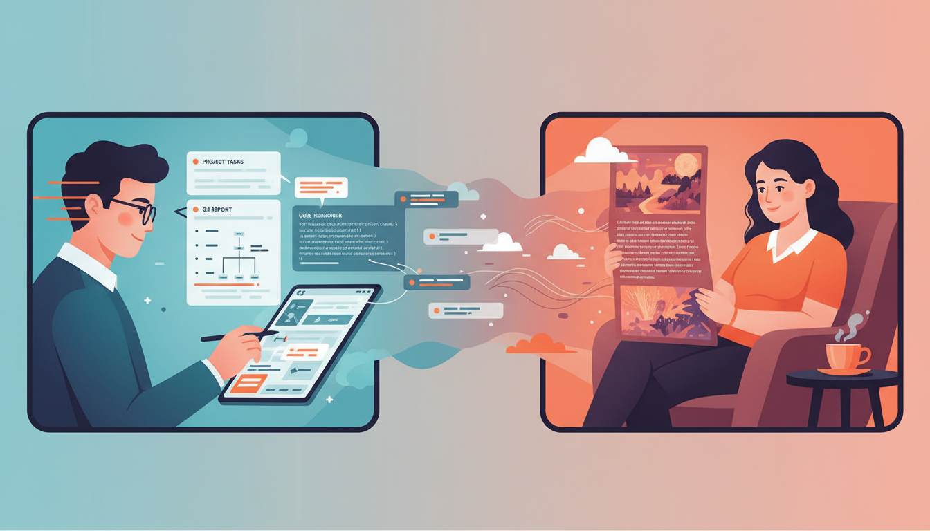
So yeh. Let me walk you through something that’s been rattling around in my head for months: How do we design for people who switch rapidly between utility-seeking and experience-seeking modes of content consumption?
This isn’t abstract design theory. It’s a practical problem affecting every digital product. From AI assistants to content platforms, we need to design for the reality that users aren’t just "task-focused" or "browsing" – they’re both, often within the same session, sometimes within the same minute.
The Mental Models Behind Mode-Switching Design
I’m synthesizing several frameworks to understand how mode-switching affects product design:
-
Attention Economics (Michael Goldhaber, building on Herbert Simon’s work on bounded rationality) – When information is abundant, attention becomes scarce. Understanding what consumes attention helps us design appropriately for different consumption modes.
-
Cognitive Load Theory (John Sweller) – Different modes require different cognitive resources. Utility-seeking minimizes extraneous load; experience-seeking embraces productive cognitive engagement.
-
Jobs-to-be-Done (Clayton Christensen) – Users don’t consume content for its own sake—they "hire" it to make progress. Understanding the job reveals which mode they’re in.
-
Information Foraging Theory (Peter Pirolli) – Users follow "information scent" like animals foraging for food. Task-mode users need strong scent trails; experience-mode users can wander.
-
Flow State (Mihaly Csikszentmihalyi) – Experiential content aims for flow—the balance of challenge and skill that creates immersive engagement.
The synthesis: When users switch modes, they’re switching cognitive strategies, attention allocation, and the "job" they’re hiring content to do. Products that don’t accommodate this create friction at every mode boundary.
The Two Modes
Utilitarian Mode
You have a specific goal. You want a specific answer. You want it efficiently.
Example from my article:
"How can I set up a workflow to transform screenshots into Obsidian notes on my iPhone?"
That’s not idle curiosity. That’s a person with a problem who needs a solution. They’re in task mode. They want:
- Direct answers
- Clear steps
- No fluff or storytelling
- Speed and efficiency
They’re not reading for enjoyment. They’re consuming content as a tool to accomplish something.
Experiential Mode
You’re browsing, discovering, enjoying. No specific goal. Open to serendipity.
Scrolling TikTok. Reading a thoughtful essay. Exploring ideas. Following curiosity.
You’re in experience mode. You want:
- Narrative and story
- Surprising connections
- Room to think and reflect
- Content that rewards attention
You’re not trying to solve a problem. You’re experiencing content for its own sake – for learning, entertainment, or social connection.
Why This Matters (And Why Now)
The distinction has always existed. But three things make it urgent now:
1. AI Changes Utilitarian Consumption
ChatGPT, Claude, and other LLMs are dramatically better at serving utilitarian needs. Ask "How do I [task]?" and get a direct, customized answer instantly.
This shifts the baseline. If AI can handle utilitarian content more efficiently, what’s left for human-designed content experiences?
Potentially: The experiential mode. The content that rewards slowing down, thinking deeply, making connections. The stuff AI can’t (yet) deliver as well as humans crafting deliberate experiences.
2. We Underestimate Mode-Switching Speed
Users don’t enter "task mode" for an hour and "browsing mode" for another hour. They switch continuously.
You’re reading an essay (experiential), encounter a concept, Google for more info (utilitarian), find an article, start reading it for the answer (utilitarian), get interested in a tangent (experiential), keep reading for enjoyment.
Products don’t accommodate this switching well. They’re designed for one mode or the other.
3. Attention Is Increasingly Scarce
The more AI handles utilitarian tasks, the more valuable human attention becomes for experiences that actually require consciousness.
Quick answers don’t need your full attention anymore – AI can fetch those. But genuine understanding, creative synthesis, meaningful reflection? That requires you to be present.
Experiential content becomes more valuable as utilitarian content becomes AI-mediated.
Design Implications
This framework changes how we should think about product design.
For Content Platforms (Like WordPress)
Gutenberg blocks – WordPress’s block editor – exemplify good mode-switching design.
Clear visual differentiation between:
- Code blocks (utilitarian – copy/paste the solution)
- Paragraph blocks (experiential – read for understanding)
- Heading blocks (navigation – scan for what you need)
The structure helps readers who are in task mode quickly find actionable content, while maintaining narrative flow for readers in experiential mode.
Good technical blog posts do this intuitively:
- "Here’s the problem…" (experience)
- "Here’s the solution:" (utility)
- "Why this works…" (experience)
- Code block (utility)
Terrible technical blog posts bury the solution in 15 paragraphs of backstory. They force task-mode readers to wade through experiential content.
For AI Assistants
ChatGPT and Claude struggle with this. They default to utilitarian – answer the question efficiently.
But users sometimes want expansive exploration (experiential mode). "Tell me about Byzantine history" shouldn’t get the same treatment as "How do I fix a leaky faucet?"
Good AI assistants will detect mode and adjust:
- Task detected → Direct, structured, actionable
- Exploration detected → Narrative, tangents, connections
Right now, users have to specify: "Explain like I’m 5" (experiential) vs "Give me the steps" (utilitarian).
For Digital Products Generally
Example: Email
- Utilitarian: "Where’s my package?" → Tracking number, status, done.
- Experiential: Newsletter with essays → Designed for reading pleasure.
Products that mix these without clear differentiation create friction. Gmail’s tabs (Primary, Social, Promotions) attempt this separation. Mixed success.
Example: Social Media
- Utilitarian: "What time is the event?" → Info, leave.
- Experiential: Scroll feed, discover content, engage.
TikTok’s short-form video optimizes for experiential mode. Twitter tries to serve both and often serves neither well.
Example: Documentation
- Utilitarian: API reference – just show me the parameters.
- Experiential: Conceptual guides – help me understand the philosophy.
Good docs (Stripe, Tailwind) separate these clearly. Bad docs mix them confusingly.
What WordPress Gets Right (And Could Do Better)
WordPress serves millions of sites. Many are utilitarian (business sites, documentation). Many are experiential (blogs, magazines, portfolios).
What works:
- Blocks enable mode-appropriate design: Code blocks for utility, quote blocks for emphasis, paragraph blocks for narrative.
- Clear information architecture: Docs site vs blog vs showcase – different modes, different designs.
- Extensibility: Plugins can optimize for specific modes (WooCommerce for utility, portfolio themes for experience).
What could improve:
- AI integration: Help writers identify when they’re forcing readers to mode-switch awkwardly. "This tutorial has 800 words before the first code block – consider restructuring."
- Reader mode detection: Recognize when visitors are in task mode (search → land on post → scan for answer) vs experience mode (homepage → browse → read multiple posts). Adjust layout/emphasis accordingly.
- Mode-specific templates: "Task-focused post template" with solution-first structure. "Narrative post template" for storytelling.
The Broader Question
This essay was prompted by repeated contemplation about how AI’s growing capabilities affect content design and human attention.
If AI becomes the default for utilitarian consumption, what does that mean for human-created content?
Potentially: A renaissance of experiential content. Writing that’s worth reading for the experience, not just the information extraction.
Long-form essays. Narrative storytelling. Artful design. Content that rewards presence and attention.
The 500-word blog post answering "How to [task]" gets commoditized by AI. The 3,000-word essay exploring an idea from multiple angles becomes more valuable because it delivers an experience AI can’t replicate.
Exploring Extremes: The Displacement Sequence
Using my displacement sequence pattern, here’s the order I expect content disruption to unfold:
First: Simple Q&A content ("How do I reset my password?") – AI already handles this better than most help docs.
Second: Multi-step tutorials – AI can generate custom walkthroughs for specific contexts.
Third: Conceptual explanations – AI improves at connecting dots and explaining frameworks.
Last: Experiential content that rewards sustained attention – essays, narratives, artful presentations that create moments of insight.
This follows Christensen’s disruption playbook: AI starts low-end (simple queries), improves rapidly, moves upmarket.
Second-Order Thinking: What Happens Next?
If AI commoditizes utilitarian content:
- → Content creators shift to experiential mode exclusively
- → Which means less direct-answer content exists for humans to consume
- → So AI becomes the ONLY interface for utilitarian needs
- → Making human-created utility content even less viable
- → Creating a self-reinforcing cycle toward AI-mediated utility consumption
This isn’t necessarily bad—but it’s worth thinking through the consequences.
Extreme Constraint: What If Mode-Switching Happened Every 30 Seconds?
Let’s add an artificial constraint: imagine users switched modes every 30 seconds instead of every few minutes.
What would break?
- Current content structure (narrative flow requires sustained attention)
- Traditional article formats (intro → body → conclusion)
- Most documentation (assumes task-mode users stay focused)
What becomes necessary?
- Micro-content blocks that work independently
- Visual markers for every paragraph’s mode intent
- Real-time mode detection and layout adjustment
- Content that degrades gracefully when attention fragments
This extreme reveals something important: our content systems assume cognitive continuity that might not exist. Even at normal switching speeds, we’re designing for an idealized attentive user who doesn’t match reality.
The Design Challenge
"From AI assistants to digital platforms, how can we design for rapid mode switching in real life?"
That’s the core design challenge.
Because users don’t announce their mode. They just switch. Mid-session, mid-article, mid-thought.
Products that only optimize for one mode frustrate users. Products that try to serve both but don’t clearly differentiate create cognitive overload.
The answer probably involves:
- Clear visual/structural differentiation (like Gutenberg blocks)
- Contextual awareness of user intent (search query → task mode likely)
- Explicit mode toggles when ambiguity exists ("Quick answer" vs "Full explanation")
- Respecting attention – don’t force experiential content on task-mode users, don’t over-compress for experience-seekers
This is an open design problem. I don’t have complete answers. But framing the distinction clearly feels like necessary first step.
Where I Might Be Wrong
This analysis assumes several things that could turn out to be incorrect:
I’m assuming that mode-switching is frequent enough to warrant significant design accommodation. But if most users actually remain in one mode for extended periods, optimizing for single-mode clarity might be more valuable than flexibility.
I’m assuming that AI will primarily serve utilitarian needs while humans excel at experiential content. But AI might become genuinely good at crafting engaging narratives, creating curiosity loops, and delivering experiential value—making this distinction less meaningful than I’m modeling.
I’m assuming that users consciously experience friction when products don’t accommodate mode-switching. But if the friction is subtle or users have adapted their behavior to work around it, the design problem might be less urgent than I’m suggesting.
I’m assuming that explicit mode differentiation improves user experience. But some research on decision fatigue suggests that giving users more choices can decrease satisfaction. Perhaps products that just pick one mode and execute it excellently outperform flexible systems.
An alternative view would emphasize that successful products often deliberately constrain themselves to one mode. TikTok is purely experiential; Google Search is purely utilitarian. The most popular products might succeed by refusing to serve both modes rather than trying to accommodate rapid switching.
I could be wrong about cognitive load theory application. Maybe the overhead of detecting and signaling modes creates more friction than it solves. Sometimes "just show everything and let users figure it out" might actually be lower cognitive load than explicit mode management.
If I’m overestimating the frequency or impact of mode-switching, or underestimating the value of mode-focused simplicity, then the entire framework becomes less useful. But understanding this dimension of user behavior—even if the solutions remain uncertain—still helps inform design decisions.
Why This Matters
This framework connects themes I’ve been exploring for years:
- How technology affects human attention
- How AI changes what’s valuable in human creativity
- How product design should accommodate actual human behavior (not idealized use cases)
If we don’t design for mode-switching, we create friction. If we design well for it, we create products that feel effortless.
That’s worth getting right.
Published: July 29, 2024
Further Reading:
- Attention Economy – Herbert Simon’s foundational work
- Cognitive Load Theory – Nielsen Norman Group
- Information Foraging Theory – Nielsen Norman Group
- Flow: The Psychology of Optimal Experience – Mihaly Csikszentmihalyi
- Competing Against Luck – Clayton Christensen on Jobs-to-be-Done